
Material in Unit 6 is optional. You are not expected to know this for a test and there are no labs or projects using this material.
Using pandas to plot climate change data
This guide shows how to use pandas to plot climate change data. If you are new to pandas, see introduction to pandas.
This guide is NOT designed to give you a thorough introduction to plotting with pandas. It uses some more advanced techniques. Rather, I just want to show you some real-world applications of pandas using a topic I am passionate about. That’s a great way to learn how to plot in Python — find something you’re interested in and then dive in.
This notebook is inspired by the R hockeystick library, which makes it really easy to plot some common climate change graphs.
You can view a Google Colab notebook of this guide page.
BYU Forum from Dr. Katharine Hayhoe
To gain some context on the importance of climate change, watch this BYU forum from Dr. Katharine Hayhoe. Dr. Hayhoe is a renowned climate scientist and a Christian. She gave this talk in fall semester 2022 and received a standing ovation. Dr. Hayhoe explained how being a Christian means loving all of God’s creations. This led her to become a climate scientist and she believes addressing climate change is “a true expression of God’s love.”
CO2 Emissions
We are first going to plot worldwide emissions. This dataset includes years and the emitted each year, for each country. We are going to look at just the worldwide data.
import pandas as pd

# CO2 data can be found at
# https://github.com/owid/co2-data

# An explanation of columns is at
# https://github.com/owid/co2-data/blob/master/owid-co2-codebook.csv


def plot_global_co2_per_year(csv_filename):

    # convert the CSV file into a Pandas dataframe
    data = pd.read_csv(csv_filename)

    # get the subset of the data where the country column is equal to 'World'
    world = data[data["country"].eq("World")]

    # create a new column where co2 is measured in gigatons instead of megatons
    world["co2"].div(1000)

    # create a line plot with x = year and y = GTco2
    # set the figure size, title, xlabel, ylabel
    plot = world.plot.line(
        x="year",
        y="co2",
        figsize=(10, 4),
        title="Atmospheric $CO_2$ Emissions, World ",
        xlabel="year",
        ylabel="Gt $CO_2$ per year",
    )

    # get a figure for the plot
    fig = plot.get_figure()

    # save the figure to a file
    fig.savefig("global-co2-per-year.png")


if __name__ == "__main__":
    plot_global_co2_per_year("owid-co2-data.csv")
This creates the following plot:
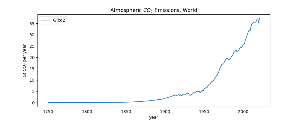
Some of the things you see in the code above include:
-
data = pd.read_csv('https://raw.githubusercontent.com/owid/co2-data/master/owid-co2-data.csv')— We can load datasets over the Internet. -
world = data[data["country"].eq("World")]— This gets a subset of the data where thecountrycolumn is equal toWorld. The dataset contains data for every country, but we just want to look at the worldwide data. -
world["co2"].div(1000)— This divides the entireco2column by 1000, so we can convert megatons to gigatons. It modifies the column instead of returning a new dataframe. -
$CO_2$— This uses LaTeX math notation, which is valid in CoLab notebooks and in strings when plotting.
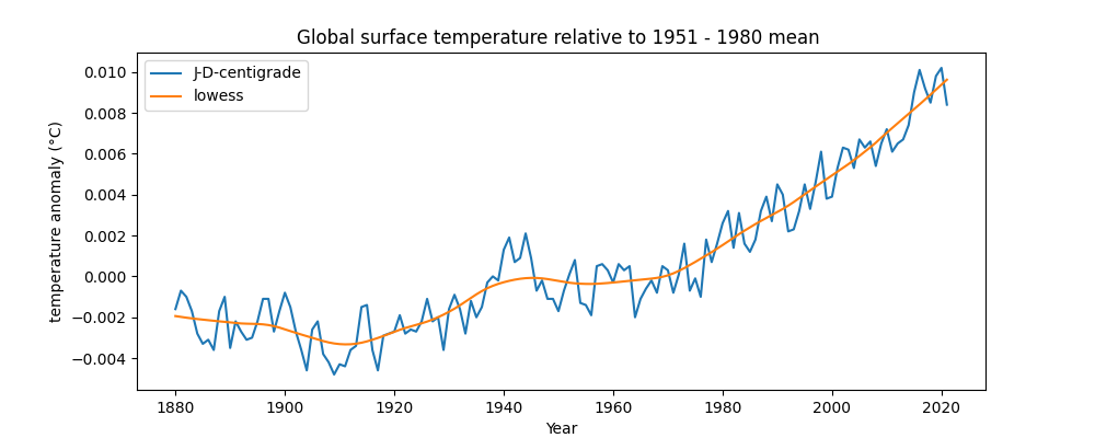
Global temperature anomalies
Next we are going to plot land-surface air and sea water temperature anomalies. This data shows how much the temperature of the earth (including both air and sea) has warmed relative to a mean of the data from 1951 to 1980.
We are going to plot both the raw data — the anomaly per year — and a curve that fits the data with a LOWESS smoothing, which is a form of regression analysis. This can show a smoothed trend over time.
import pandas as pd

# pip install statsmodels
from statsmodels.nonparametric.smoothers_lowess import lowess


# Global Land-Surface Air and Sea Water Temperature Anomalies
# (Land-Ocean Temperature Index, L-OTI)
# This has the global surface temperature relative to 1951-1980 mean
# https://data.giss.nasa.gov/gistemp/

# The specific file used here is
# https://data.giss.nasa.gov/gistemp/tabledata_v4/GLB.Ts+dSST.csv

# The text file contains some additional explanation
# https://data.giss.nasa.gov/gistemp/tabledata_v4/GLB.Ts+dSST.txt


def plot_global_loti_per_year(csv_filename):

    # convert the CSV file into a Pandas dataframe
    # we need to skip the first row!
    data = pd.read_csv(csv_filename, skiprows=1)

    # the column labeled J-D is the anomaly for that entire year
    # the data description says to divide by 100 to convert to centigrade

    # skip years where annual average not computed
    data = data[data["J-D"] != "***"]

    # create a new column where the anomaly is measured in degrees centigrade
    # must convert column to a float first, since Pandas sees it as a string
    data["J-D-centigrade"] = data["J-D"].astype(float).div(100)

    # create a line plot with x = year and y = J-D-centigrade
    # set the figure size, title, xlabel, ylabel
    ax = data.plot.line(
        x="Year",
        y="J-D-centigrade",
        figsize=(10, 4),
        title="Global surface temperature relative to 1951 - 1980 mean ",
        xlabel="year",
        ylabel="temperature anomaly (°C)",
    )

    # get x and y values for LOWESS
    x = data['Year'].values
    y = data['J-D-centigrade']

    # run LOWESS
    y_hat = lowess(y, x, frac=1/5)

    # add LOWESS to data frame
    data['lowess'] = y_hat[:,1]

    data.plot(ax=ax, x='Year', y='lowess')

    # get a figure for the plot
    fig = ax.get_figure()

    # save the figure to a file
    fig.savefig("global-loti-per-year.png")


if __name__ == "__main__":
    plot_global_loti_per_year("GLB.TS+dSST.csv")
This creates the following plot:
Some of the things you see in the code above include:
-
data = data[data["J-D"] != "***"]— We are using theJ-Dcolumn because this has data averaged for the whole year, January through December. We are going to ignore any data that is incomplete, which is marked in this dataset with***. -
data["J-D-centigrade"] = data["J-D"].astype(float).div(100)— This creates a new column where the anomaly is measured in degrees centigrade. We first useastype()to convert the column to a float, since Pandas sees it as a string. This is because values start with-for negative numbers. -
We want to compute the LOWESS smoothing using a
numpyarray. numpy is a library that provides fast scientific computation for Python. -
x = data['Year']andy = data['J-D-centigrade']— Gets separate columns forxandyvalues for the LOWESS smoothing. -
y_hat = lowess(y, x, frac=1/5)— Calculates the LOWESS smoothing, using the x and y values and a parameterfracequal to1/5— the lower the value, the greater the smoothing. Thelowessfunction comes from a statsmodels library. It returns a two-dimensional array of (x, y) values. -
data['lowess'] = y_hat[:,1]— This adds a column with theyvalues of the LOWESS calculation to the dataframe. The notationy_hat[:,1]says to get all the rows, and the first column, from they_hatarray. -
data.plot(ax=ax, x='Year', y='lowess')— This adds an additional line plot onto our previous plot. Theax = axsets the axis to the the same as the previous plot.
Global Warming Stripes
We now create a plot of ‘warming stripes’, which were created by Professor Ed Hawkins, a climate scientist. You can create your own stripes at #ShowYourStripes.
import pandas as pd

# Be sure to run:
# pip install matplotlib
import matplotlib.pyplot as plt
from matplotlib.patches import Rectangle
from matplotlib.collections import PatchCollection
from matplotlib.colors import ListedColormap

# code from
# https://matplotlib.org/matplotblog/posts/warming-stripes/

# using HADCRUT data from
# https://www.metoffice.gov.uk/hadobs/hadcrut4/data/current/time_series/HadCRUT.4.6.0.0.annual_ns_avg.txt

# This data is published by the Met Office in the UK. It shows
# combined sea and land surface temperatures as +/- from the average for
#the years 1961 to 1990.

# See https://www.metoffice.gov.uk/hadobs/hadcrut4/ for more details.

# An explanation of the columns is here:
# https://www.metoffice.gov.uk/hadobs/hadcrut4/data/current/series_format.html

# first and last years in the dataset
FIRST = 1850
LAST = 2021

# Reference period for the center of the color scale
FIRST_REFERENCE = 1971
LAST_REFERENCE = 2000
LIM = 0.7 # degrees

def global_warming_stripes(fwf_filename):
    # read a fixed-width file (fwf) into a Pandas data frame
    # a fixed-width file has file formatted into columns using spaces

    # index_col --  which column to use for row labels
    # usecols --  which columns to use from the file
    # names --  how to name the columns
    # header -- indicates there is no first row with column names
    data = pd.read_fwf(fwf_filename, index_col=0, usecols=(0, 1),
                        names=['year', 'anomaly'], header=None)

    # create a new table that has all the columns where the year is between
    # FIRST and LAST, dropping any that don't have data
    data = data.loc[FIRST:LAST, 'anomaly'].dropna()

    # take the mean of the anomaly data for the years between FIRST_REFERENCE
    # and LAST_REFERENCE
    reference = data.loc[FIRST_REFERENCE:LAST_REFERENCE].mean()

    # create a set of colors for the bars
    # the colors in this colormap come from http://colorbrewer2.org
    # the 8 more saturated colors from the 9 blues / 9 reds

    cmap = ListedColormap([
        '#08306b', '#08519c', '#2171b5', '#4292c6',
        '#6baed6', '#9ecae1', '#c6dbef', '#deebf7',
        '#fee0d2', '#fcbba1', '#fc9272', '#fb6a4a',
        '#ef3b2c', '#cb181d', '#a50f15', '#67000d',
    ])


    # create a figure , giving its size
    fig = plt.figure(figsize=(10, 1))

    # add axes -- the dimensions are [left, bottom, width, height]
    ax = fig.add_axes([0, 0, 1, 1])
    # turn off showing lines, ticks, labels, etc for the axes
    ax.set_axis_off()

    # create a collection of rectangles, one for each year
    rectangles = []
    for year in range(FIRST, LAST + 1):
        # create a Rectangle with (x, y) starting point, width, height
        rectangles.append(Rectangle((year, 0), 1, 1))

    collection = PatchCollection(rectangles)

    # set data, colormap and color limits for the collection
    collection.set_array(data)
    collection.set_cmap(cmap)
    collection.set_clim(reference - LIM, reference + LIM)
    ax.add_collection(collection)

    # set the limits on the axes
    ax.set_ylim(0, 1)
    ax.set_xlim(FIRST, LAST + 1)

    # save the figure
    fig.savefig('global-warming-stripes.png')


if __name__ == '__main__':
    global_warming_stripes('HadCRUT.4.6.0.0.annual_ns_avg.txt')
This creates the following plot:

Some of the things you see in the code above include:
-
import matplotlib.pyplot as plt— We import various items from the matplotlib library. This is a low level, and thus very powerful, library for plotting in Python. -
pd.read_fwf()— we useread_fwfto read the dataset because the file is NOT stored as a CSV, it is stored as a fixed-with file, meaning the columns are all a fixed width, using spaces. -
data = data.loc[FIRST:LAST, 'anomaly'].dropna()— This gets certain rows from the dataframe, dropping any that are missing data. -
reference = data.loc[FIRST_REFERENCE:LAST_REFERENCE].mean()— We are going to be plotting bars of various colors. So we use this to get the mean of the anomaly for the period 1971 — 2000. We will use this as the middle temperature and plot colder temperatures in shades of blue, with warmer temperatures in red. -
cmap = ListedColormap(...)— This creates a colormap, meaning a list of colors, using their hex values. -
fig = plt.figure(figsize=(10, 1))— Creates a blank figure of a given size. -
ax = fig.add_axes([0, 0, 1, 1])— This adds an axis object to the figure, which is a container for the X, Y axes, the plot, the legend, and so forth. A plot can contain multiple “axes”, meaning it can have multiple subfigures. See here for a good visualization. -
Rectangle((year, 0), 1, 1)— Each bar on the chart has a size, starting from the (year, 0) point in (x, y) space, and extending 1 unit high and 1 unit wide. -
PatchCollection(rectangles)— This is a collection of rectangles, so we can operate on them all at once. -
collection.set_array(data)— This maps each rectangle in the collection to one of theanomalyvalues from our dataset. -
collection.set_cmap(cmap)— This provides our colormap (a list of colors) to the collection of rectangles. -
collection.set_clim(reference - LIM, reference + LIM)— This maps each rectangle to a color. From above, each rectangle is associated with an anomaly value. This command indicates that low range for the anomaly (reference - LIM) is set to the first color in the map, and the high range for the anomaly (reference + LIM) is set to the last color in the map. The rest are colors in between. -
ax.add_collection(collection)— This adds all of the rectangles to the plot.